從入門到精通:Python 可視化實(shí)戰(zhàn),這一篇就夠了(含完整代碼)
Python作為數(shù)據(jù)科學(xué)領(lǐng)域最受歡迎的編程語言之一,提供了豐富的可視化庫。本文將介紹如何使用Python創(chuàng)建精美的數(shù)據(jù)可視化圖案,并通過一個(gè)完整案例展示其強(qiáng)大功能。

一、主流可視化庫介紹
Python中常用的可視化庫包括:
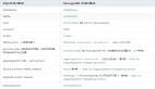
- Matplotlib:最基礎(chǔ)、最常用的繪圖庫,提供了類似MATLAB的繪圖接口
- Seaborn:基于Matplotlib,提供了更美觀的默認(rèn)樣式和高級統(tǒng)計(jì)圖表
- Plotly:支持交互式可視化,可生成動態(tài)圖表
- Bokeh:專注于Web瀏覽器的交互式可視化
二、案例:銷售數(shù)據(jù)多維度分析可視化
下面通過一個(gè)實(shí)際案例,展示如何創(chuàng)建包含多個(gè)子圖的綜合性數(shù)據(jù)可視化儀表板。我們將模擬一年的產(chǎn)品銷售數(shù)據(jù),并從多個(gè)角度進(jìn)行可視化分析。
1. 數(shù)據(jù)準(zhǔn)備
首先生成模擬的銷售數(shù)據(jù),包括日期、銷售額、產(chǎn)品類別、地區(qū)等維度。為確保結(jié)果可復(fù)現(xiàn),我們設(shè)置隨機(jī)種子為42。
2. 可視化設(shè)計(jì)
我們將創(chuàng)建一個(gè)包含四個(gè)子圖的儀表板:
- 折線圖:展示月度銷售趨勢,觀察銷售額隨時(shí)間的變化規(guī)律
- 柱狀圖:對比不同產(chǎn)品類別的總銷售額
- 餅圖:展示各地區(qū)銷售額占比
- 散點(diǎn)圖:分析銷售額與訂單數(shù)量的相關(guān)性
3. 完整代碼實(shí)現(xiàn)
下面是完整的代碼實(shí)現(xiàn),包含數(shù)據(jù)生成和可視化繪制:
import numpy as np
import pandas as pd
import matplotlib.pyplot as plt
from datetime import datetime, timedelta
import seaborn as sns
import warnings

# 忽略字體警告
warnings.filterwarnings('ignore')

# 設(shè)置隨機(jī)種子
np.random.seed(42)

# ====== 關(guān)鍵修改:中文字體配置 ======
# Windows用戶使用以下配置
plt.rcParams['font.sans-serif'] = ['Microsoft YaHei', 'SimHei', 'Arial Unicode MS']
plt.rcParams['axes.unicode_minus'] = False

# 如果上述字體都不可用,可以嘗試:
# plt.rcParams['font.family'] = ['sans-serif']
# plt.rcParams['font.sans-serif'] = ['DejaVu Sans']
# 然后把中文換成英文標(biāo)簽

sns.set_style("whitegrid")

# 生成模擬銷售數(shù)據(jù)
def generate_sales_data(n_records=365):
    """生成一年的銷售數(shù)據(jù)"""
    start_date = datetime(2023, 1, 1)
    dates = [start_date + timedelta(days=x) for x in range(n_records)]

    categories = ['Electronics', 'Clothing', 'Food', 'Books', 'Home']  # 使用英文
    regions = ['East', 'North', 'South', 'Southwest', 'Northeast']

    data = {
        'Date': dates,
        'Sales': np.random.normal(50000, 15000, n_records).clip(min=10000),
        'Orders': np.random.poisson(100, n_records),
        'Category': np.random.choice(categories, n_records),
        'Region': np.random.choice(regions, n_records)
    }

    return pd.DataFrame(data)

# 生成數(shù)據(jù)
df = generate_sales_data()

# 創(chuàng)建圖形
fig = plt.figure(figsize=(16, 10))
fig.suptitle('Sales Data Dashboard', fontsize=20, fontweight='bold', y=0.995)

# 1. 月度銷售趨勢
ax1 = plt.subplot(2, 2, 1)
monthly_sales = df.groupby(df['Date'].dt.to_period('M'))['Sales'].sum()
monthly_sales.index = monthly_sales.index.to_timestamp()
ax1.plot(monthly_sales.index, monthly_sales.values,
         marker='o', linewidth=2.5, markersize=8, color='#2E86AB')
ax1.fill_between(monthly_sales.index, monthly_sales.values, alpha=0.3, color='#2E86AB')
ax1.set_title('Monthly Sales Trend', fontsize=14, fontweight='bold', pad=15)
ax1.set_xlabel('Month', fontsize=11)
ax1.set_ylabel('Sales Amount', fontsize=11)
ax1.grid(True, alpha=0.3)

# 2. 產(chǎn)品類別銷售額
ax2 = plt.subplot(2, 2, 2)
category_sales = df.groupby('Category')['Sales'].sum().sort_values(ascending=False)
colors = sns.color_palette("husl", len(category_sales))
bars = ax2.bar(range(len(category_sales)), category_sales.values, color=colors, alpha=0.8)
ax2.set_title('Sales by Category', fontsize=14, fontweight='bold', pad=15)
ax2.set_xlabel('Category', fontsize=11)
ax2.set_ylabel('Total Sales', fontsize=11)
ax2.set_xticks(range(len(category_sales)))
ax2.set_xticklabels(category_sales.index, rotation=15)
ax2.grid(True, alpha=0.3, axis='y')

for bar in bars:
    height = bar.get_height()
    ax2.text(bar.get_x() + bar.get_width()/2., height,
             f'{int(height/10000)}w',
             ha='center', va='bottom', fontsize=9)

# 3. 地區(qū)銷售占比
ax3 = plt.subplot(2, 2, 3)
region_sales = df.groupby('Region')['Sales'].sum()
colors_pie = sns.color_palette("Set2", len(region_sales))
wedges, texts, autotexts = ax3.pie(region_sales.values,
                                     labels=region_sales.index,
                                     autopct='%1.1f%%',
                                     colors=colors_pie,
                                     startangle=90,
                                     textprops={'fontsize': 10})
ax3.set_title('Sales by Region', fontsize=14, fontweight='bold', pad=15)
for autotext in autotexts:
    autotext.set_color('white')
    autotext.set_fontweight('bold')

# 4. 散點(diǎn)圖
ax4 = plt.subplot(2, 2, 4)
scatter = ax4.scatter(df['Orders'], df['Sales'],
                     c=df['Sales'], cmap='viridis',
                     alpha=0.6, s=50, edgecolors='black', linewidth=0.5)
ax4.set_title('Sales vs Orders', fontsize=14, fontweight='bold', pad=15)
ax4.set_xlabel('Order Count', fontsize=11)
ax4.set_ylabel('Sales Amount', fontsize=11)
ax4.grid(True, alpha=0.3)

z = np.polyfit(df['Orders'], df['Sales'], 1)
p = np.poly1d(z)
ax4.plot(df['Orders'].sort_values(),
         p(df['Orders'].sort_values()),
         "r--", linewidth=2, alpha=0.8, label='Trend Line')
ax4.legend(fontsize=10)

cbar = plt.colorbar(scatter, ax=ax4)
cbar.set_label('Sales', fontsize=10)

plt.tight_layout()
plt.show()

print("=" * 50)
print("Data Summary")
print("=" * 50)
print(f"\nTotal Sales: {df['Sales'].sum():,.0f}")
print(f"Average Daily Sales: {df['Sales'].mean():,.0f}")
print(f"Total Orders: {df['Orders'].sum():,}")

4. 代碼解析
數(shù)據(jù)生成部分:
- 使用np.random.seed(42)設(shè)置隨機(jī)種子,確保每次運(yùn)行生成相同的數(shù)據(jù)
- 生成365天的銷售數(shù)據(jù),包含日期、銷售額、訂單數(shù)量、產(chǎn)品類別和地區(qū)信息
- 銷售額服從正態(tài)分布,訂單數(shù)量服從泊松分布,更貼近實(shí)際情況
可視化部分:
- 使用subplot創(chuàng)建2×2的子圖布局
- 折線圖展示時(shí)間序列趨勢,使用填充效果增強(qiáng)視覺效果
- 柱狀圖使用不同顏色區(qū)分類別,并添加數(shù)值標(biāo)簽
- 餅圖直觀展示比例關(guān)系
- 散點(diǎn)圖使用顏色映射表示第三維度數(shù)據(jù),并添加趨勢線
5. 運(yùn)行效果
運(yùn)行上述代碼后,將生成一個(gè)包含四個(gè)子圖的綜合儀表板,清晰展示銷售數(shù)據(jù)的多個(gè)維度。同時(shí),控制臺會輸出關(guān)鍵統(tǒng)計(jì)指標(biāo),幫助快速了解數(shù)據(jù)概況。
三、可視化設(shè)計(jì)建議
- 顏色搭配:使用協(xié)調(diào)的配色方案,避免過于刺眼的顏色
- 標(biāo)題和標(biāo)簽:確保所有圖表都有清晰的標(biāo)題和坐標(biāo)軸標(biāo)簽
- 數(shù)據(jù)標(biāo)注:在關(guān)鍵數(shù)據(jù)點(diǎn)添加標(biāo)注,提高可讀性
- 布局合理:合理安排子圖位置,保持整體美觀
- 交互性:必要時(shí)可以使用Plotly等庫添加交互功能
四、總結(jié)
Python的可視化生態(tài)系統(tǒng)為數(shù)據(jù)分析提供了強(qiáng)大支持。通過合理使用Matplotlib、Seaborn等工具,我們可以創(chuàng)建既美觀又實(shí)用的數(shù)據(jù)可視化圖表。關(guān)鍵是要根據(jù)數(shù)據(jù)特點(diǎn)選擇合適的圖表類型,并注重細(xì)節(jié)設(shè)計(jì),讓可視化真正發(fā)揮傳遞信息的作用。